Spectral Segregation Index
The Spectral Segregation Index (SSI) (Echenique and Fryer, 2007) was developed to measure residential segregation of neighborhoods in a ciy. The metric can be applied to any undirected and even weighted graph. netseg relies on the node-level definition (Bojanowski, 2014).
The index is calculated with the spectral properties of the connected components of the nodes within the same group membership. A score of 0 can only be possible iff all ties are within groups. There is no upper limit for the metric.
SSI is calculated with row normalized adjacency matrix \(R = [r_{ij}]_{NxN}\) which is formed from the original network by normalizing the rows so that they sum up to 1. For every group \(G_g\), the measure defines a matrix \(B_g\), which is a sub-matrix of \(R\) that contains only the nodes belonging to group \(G_g\). A distinctive feature of the SSI is that it can be decomposed to node-level values.
The idea is that individual level segregation of nodes belonging in a certain group should be equal to the average segregation levels of same-group neighbors of the nodes. Formally,
where \(S^g_{C_i}\) is the average level of segregation in a connected component \(C_i\) of within-group interactions specified by \(B\) to which \(i\) belongs. The value of SSI for that component is equal to the largest eigen-value, \(\lambda\) of the matrix \(C_i\). The level of individual-level segregation is calculated by distributing the value of \(\lambda\) using the corresponding the eigenvector \(l\),
where \(\bar{l}\) is the mean of the values in the eigenvector \(l\).
import igraph as ig
import random
from matplotlib.colors import LinearSegmentedColormap, to_hex, Normalize
import matplotlib.cm as cm
import matplotlib.pyplot as plt
import matplotlib.patches as mpatches
import numpy as np
from netseg import ssi
from mpl_toolkits.axes_grid1 import make_axes_locatable
import requests
import tempfile

%config InlineBackend.figure_format = 'retina'

COLORS_DIV = [
    '#2C486F',
    '#436796',
    '#5E8FAE',
    '#80BDD6',
    '#B1DDE0',
    "#fdf8e7",
    '#F8E5B2',
    '#F3CF63',
    '#E9A64C',
    '#E3843B',
    '#DA584E'
 ]

COLORS = [
    '#FBE3C2',
    '#F2C88F',
    '#ECB27D',
    '#E69C6B',
    '#D37750',
    '#B9563F',
    '#92351E'
]
def get_custom_colors_hex(values):
    vmin = min(values)
    vmax = max(values)

    norm = Normalize(vmin=vmin, vmax=vmax)
    custom_cmap = LinearSegmentedColormap.from_list("custom_gradient", COLORS)

    return [to_hex(custom_cmap(i)) for i in norm(values)]
membership = [0 if i < 100 else 1 for i in range(200)]
g = ig.Graph.Erdos_Renyi(200, 0.05)
ssi(membership, g)
np.float64(0.5681125857003451)
Basics
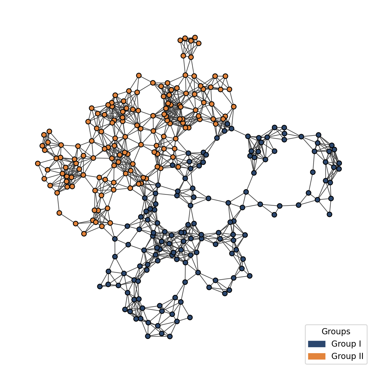
The SSI requires an undirected network. Because SSI is typically applied to spatial data, we use a Geometric Random Graph (GRG) to demonstrate its properties. A GRG randomly distributes nodes in space and connects any pairs that fall within a specified radius, effectively simulating physical networks while ignoring physical constraints like volume or overlap.
You can think about the following graph as a spatial network where nodes have exogenous properties, such as their income group, race, etc.
random.seed(3)
grg_graph = ig.Graph.GRG(n=300, radius=0.1)
membership = [0 if i < 150 else 1 for i in range(300)]
grg_graph.vs['membership'] = membership

fig, ax = plt.subplots(figsize = (8,8))
ig.plot(grg_graph,
        vertex_size = 16,
        layout = grg_graph.layout_kamada_kawai(),
        vertex_color = [COLORS_DIV[0] if i == 0 else COLORS_DIV[9] for i in grg_graph.vs['membership']],
        target = ax,
        edge_width = 0.8)

g1_patch = mpatches.Patch(color=COLORS_DIV[0], label='Group I')
g2_patch = mpatches.Patch(color=COLORS_DIV[9], label='Group II')
ax.legend(handles=[g1_patch, g2_patch], loc='lower right', title="Groups")
plt.show()
We can use netseg to calculate the SSI score for the overall network as follows:
ssi_score_network = ssi("membership", grg_graph)
print(ssi_score_network)
0.9931068638175843
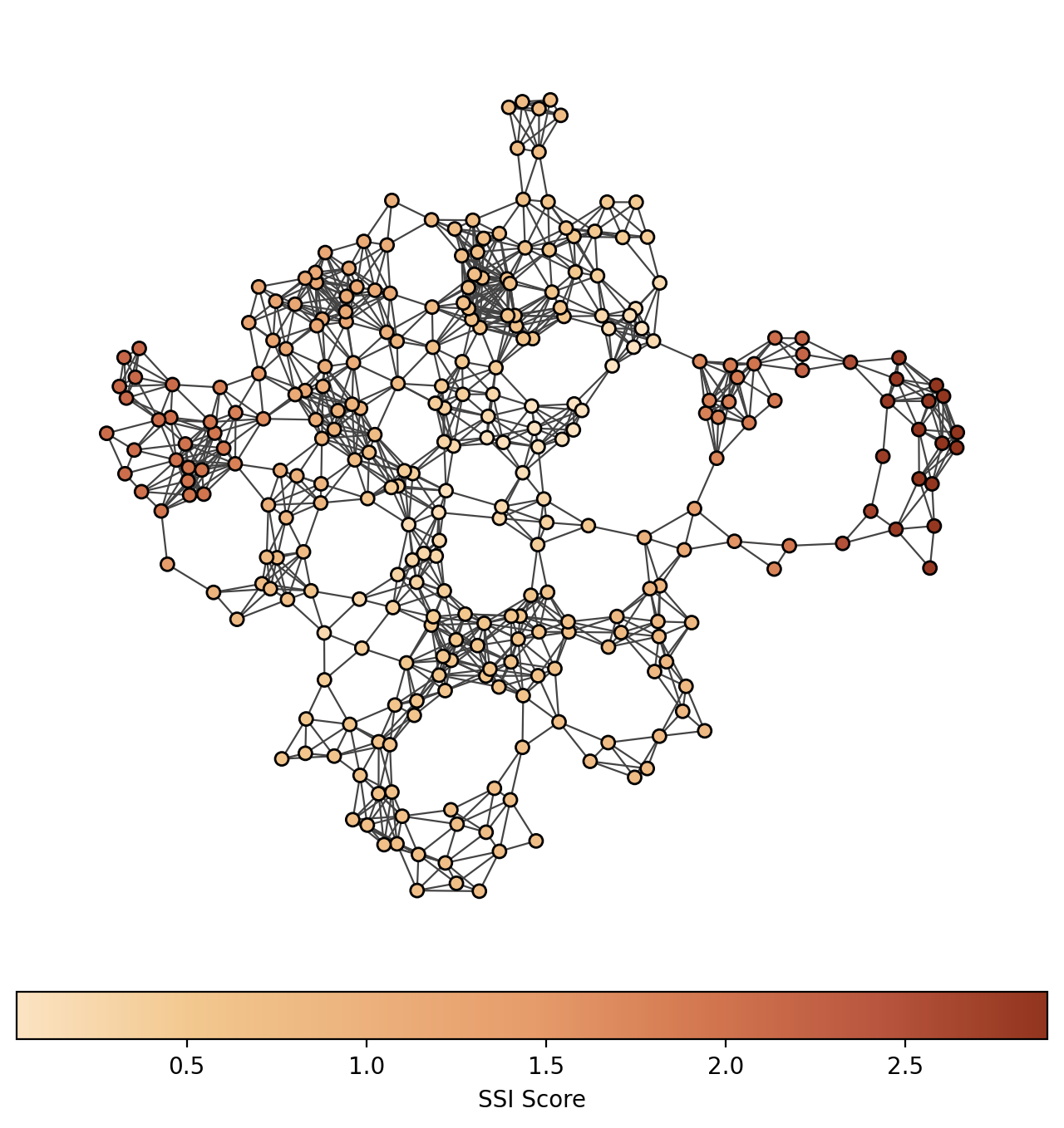
If we set the aggregate to False, we can retrieve the SSI score per node. Nodes that positioned outside has higher SSI score compared to the nodes in between groups.
by_node_ssi = ssi("membership", grg_graph, aggregate= False)
grg_graph.vs['ssi_score'] = by_node_ssi


fig, ax = plt.subplots(figsize = (8,8))
ig.plot(grg_graph,
        vertex_size = 16,
        layout = grg_graph.layout_kamada_kawai(),
        vertex_color = get_custom_colors_hex(grg_graph.vs['ssi_score']),
        target = ax,
        edge_width = 0.8)


vmin = min(grg_graph.vs['ssi_score'])
vmax = max(grg_graph.vs['ssi_score'])
norm = Normalize(vmin=vmin, vmax=vmax)
custom_cmap = LinearSegmentedColormap.from_list("custom_gradient", COLORS)
sm = cm.ScalarMappable(cmap=custom_cmap, norm=norm)
sm.set_array([])

divider = make_axes_locatable(ax)
cax = divider.append_axes("bottom", size="5%", pad=0.1)
cbar = fig.colorbar(sm, cax=cax, orientation='horizontal')
cbar.set_label('SSI Score')

plt.show()
Multiple Groups
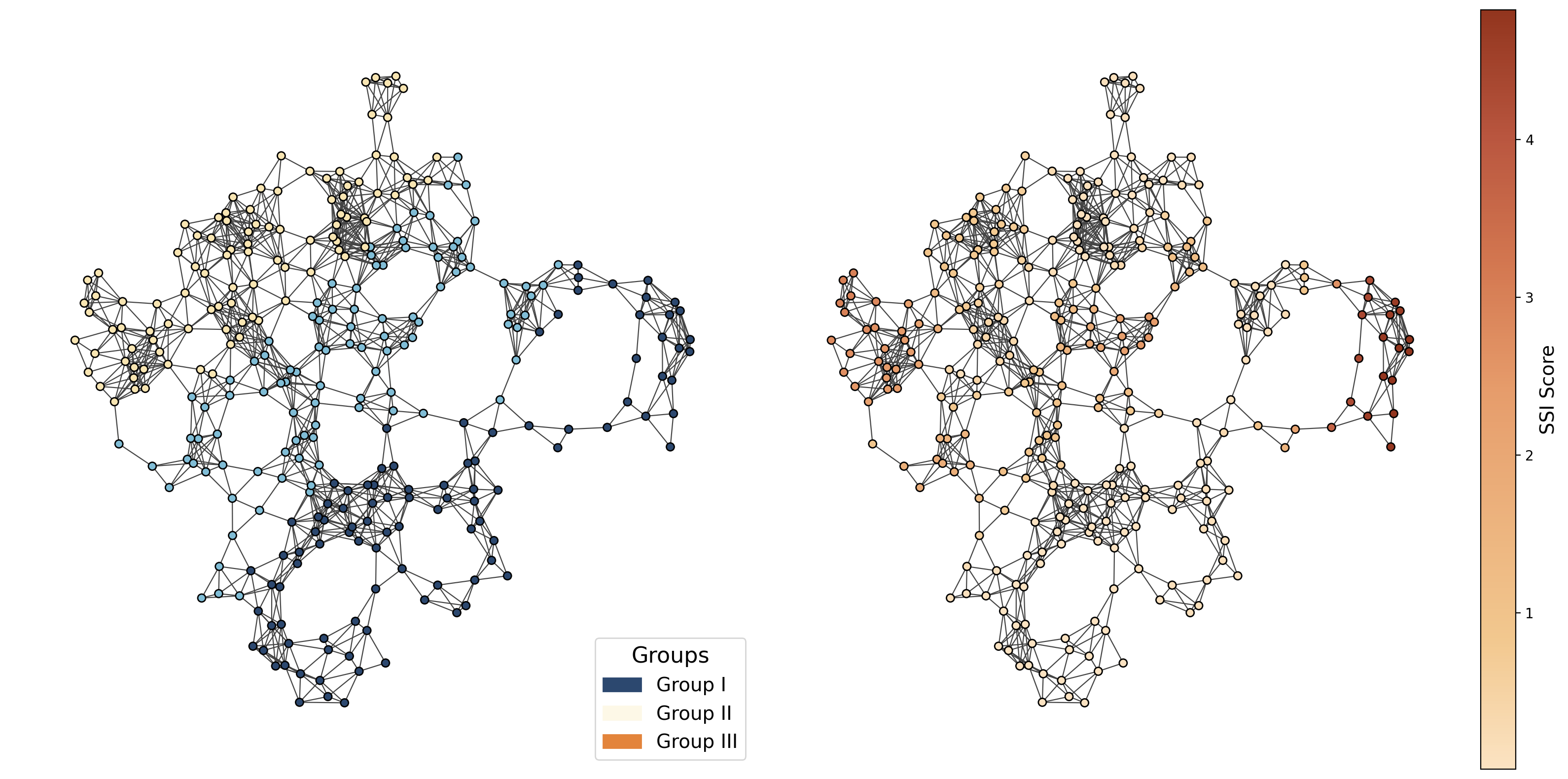
SSI can be used for multiple groups also. Let’s keep the above network as is but change the exogenous properties, creating 3 different groups.
membership_multiple = [0] * 100 + [1] * 100 + [2] * 100
grg_graph.vs['membership2'] = membership_multiple
fig,axs = plt.subplots(1,2, figsize = (16,8))
colors_dict = {0:COLORS_DIV[0], 1:COLORS_DIV[3], 2:COLORS_DIV[6]}
ig.plot(grg_graph,
        vertex_size = 16,
        layout = grg_graph.layout_kamada_kawai(),
        vertex_color = [colors_dict[i] for i in grg_graph.vs['membership2']],
        target = axs[0],
        edge_width = 0.8)

g1_patch = mpatches.Patch(color=COLORS_DIV[0], label='Group I')
g2_patch = mpatches.Patch(color=COLORS_DIV[5], label='Group II')
g3_patch = mpatches.Patch(color=COLORS_DIV[9], label='Group III')
axs[0].legend(handles=[g1_patch, g2_patch, g3_patch], loc='lower right', title="Groups", fontsize = 14, title_fontsize = 16)


by_node_ssi = ssi("membership2", grg_graph, aggregate= False)
grg_graph.vs['ssi_score'] = by_node_ssi
ig.plot(grg_graph,
        vertex_size = 16,
        layout = grg_graph.layout_kamada_kawai(),
        vertex_color = get_custom_colors_hex(grg_graph.vs['ssi_score']),
        target = axs[1],
        edge_width = 0.8)


vmin = min(grg_graph.vs['ssi_score'])
vmax = max(grg_graph.vs['ssi_score'])
norm = Normalize(vmin=vmin, vmax=vmax)
custom_cmap = LinearSegmentedColormap.from_list("custom_gradient", COLORS)
sm = cm.ScalarMappable(cmap=custom_cmap, norm=norm)
sm.set_array([])

divider = make_axes_locatable(axs[1])
cax = divider.append_axes("right", size="5%", pad=0.1)
cbar = fig.colorbar(sm, cax=cax, orientation='vertical')
cbar.set_label('SSI Score', fontsize = 14)
fig.tight_layout()


plt.show()
Example
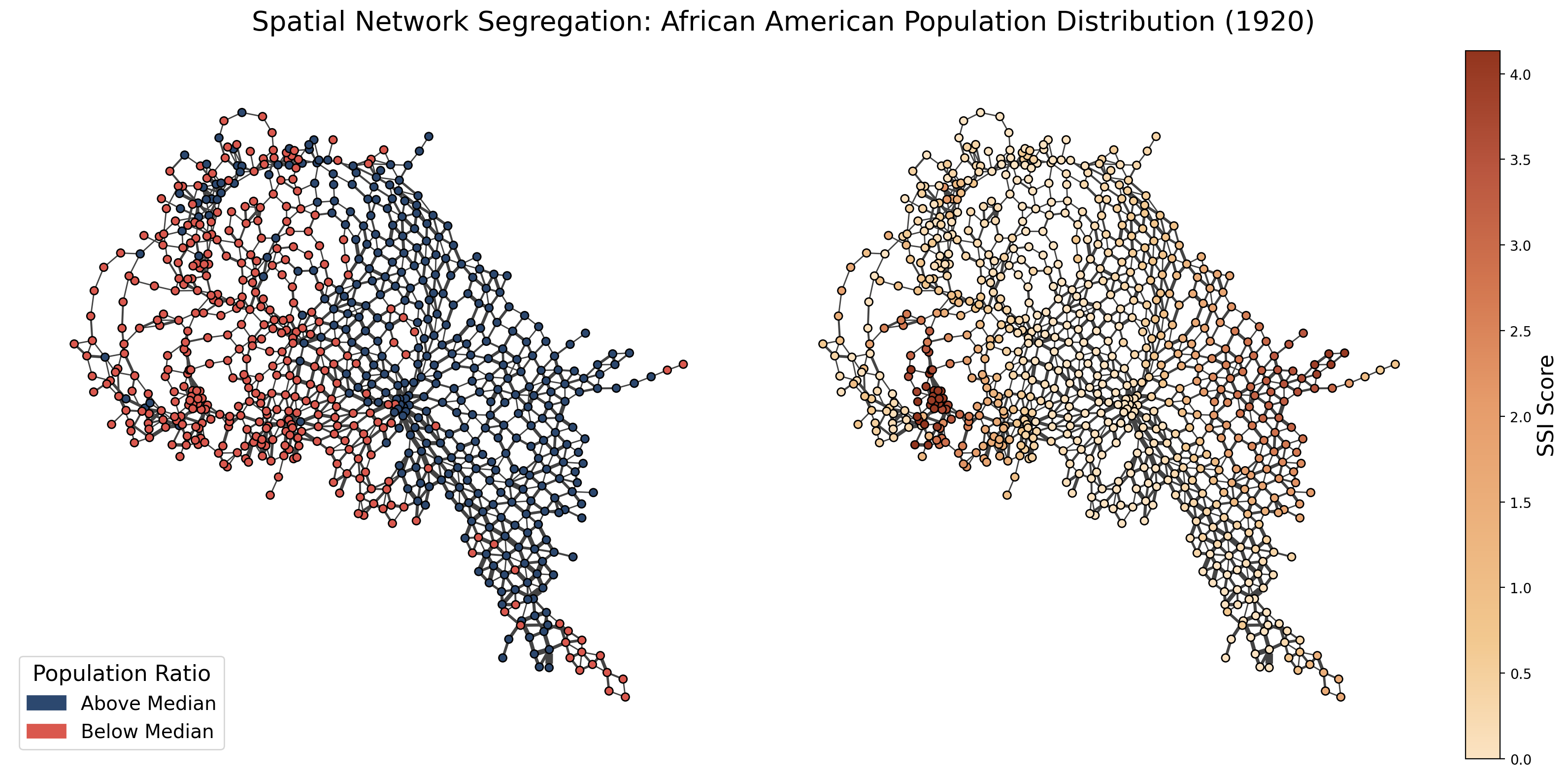
To make an empirical example, we are using the African American population ratio in 1920 retrieved from IPUMS. We aggregated the dataset in such way that each network node represents a grid, where each grid is as big as average county in United States. The edges represent the railroads running in between grids. Dataset contains the railroads from 1911 and it is created by Jeremy Atack. We are using the largest connected component of the network, disregarding 6 grids that is not connected to the main network. The nodes can either contain the nodal attribute “0”, indicating that the the African American population ratio is lower than the median, and 1, if the African American population ratio is higher than the median.
response = requests.get("https://codeberg.org/OnurB/NMC/raw/branch/main/ssi_example.graphml")

with tempfile.NamedTemporaryFile(delete=True) as tmp:
    tmp.write(response.content)
    tmp.flush()
    g_gridded = ig.Graph.Read_GraphML(tmp.name)
ssi_scores = ssi(membership= "aa_median", graph = g_gridded, aggregate= False)
g_gridded.vs['ssi_scores'] = ssi_scores
fig, axs = plt.subplots(1, 2, figsize=(16, 8))
fig.suptitle("Spatial Network Segregation: African American Population Distribution (1920)", fontsize=20)

layout = g_gridded.layout_kamada_kawai()
edge_widths = [i ** 0.5 for i in g_gridded.es['weight']]

ig.plot(
    g_gridded,
    vertex_size=16,
    layout=layout,
    edge_width=edge_widths,
    target=axs[0],
    vertex_color=[COLORS_DIV[-1] if i == 0 else COLORS_DIV[0] for i in g_gridded.vs['aa_median']]
)

am_patch = mpatches.Patch(color=COLORS_DIV[0], label='Above Median')
bm_patch = mpatches.Patch(color=COLORS_DIV[-1], label='Below Median')
axs[0].legend(handles=[am_patch, bm_patch], loc='lower left', title="Population Ratio", title_fontsize = 16, fontsize = 14)

ig.plot(
    g_gridded,
    vertex_size=16,
    layout=layout,
    edge_width=edge_widths,
    target=axs[1],
    vertex_color=get_custom_colors_hex(g_gridded.vs['ssi_scores'])
)

vmin = min(g_gridded.vs['ssi_scores'])
vmax = max(g_gridded.vs['ssi_scores'])
norm = Normalize(vmin=vmin, vmax=vmax)
custom_cmap = LinearSegmentedColormap.from_list("custom_gradient", COLORS)
sm = cm.ScalarMappable(cmap=custom_cmap, norm=norm)
sm.set_array([])

divider = make_axes_locatable(axs[1])
cax = divider.append_axes("right", size="5%", pad=0.1)
cbar = fig.colorbar(sm, cax=cax, orientation='vertical')
cbar.set_label('SSI Score', fontsize = 16)

fig.tight_layout()
plt.show()
References
Atack, Jeremy. “Historical Geographic Information Systems (GIS) database of US Railroads for Years Before 1890.” 2018,
Bojanowski, M., & Corten, R. (2014). “Measuring segregation in social networks.” Social Networks, 39, 14-32.
Echenique, F., & Fryer Jr., R. G. (2007). “A measure of segregation based on social interactions.” The Quarterly Journal of Economics, 122(2), 441-485.
Ruggles, Steven, et al. “IPUMS USA: Versión 16.0 [conjunto de datos]. Minneapolis, MN: IPUMS, 2025.”